Our Logo
The designer, the meaning, the symbolism
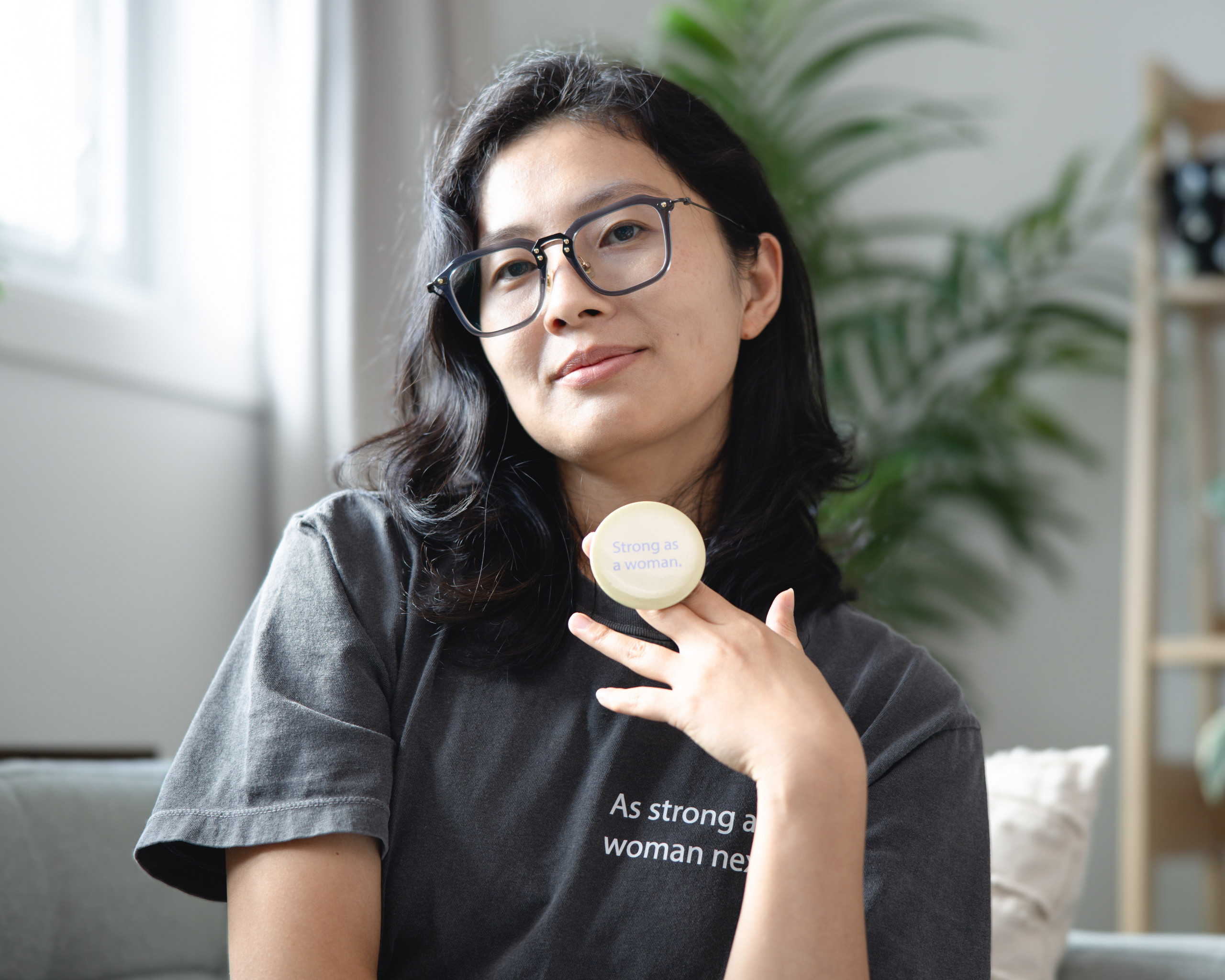
We approached the creation of our logo with immense thought, care, and intention. From the beginning, we knew the symbol representing Vanguard Impact needed to feel meaningful to our attendees, align with our mission, and be expressive of the movement we are building together. To bring this vision to life, we partnered with designer Lu Yang, whose ability to translate complex ideas into striking, memorable visual systems perfectly matched our aspirations.
Lu Yang – About the Designer

Lu is a multidisciplinary designer specializing in branding, UX, and multimedia design. She helps businesses find their authentic visual voice by translating complex concepts into clean, impactful systems. Lu’s design philosophy focuses on creating work that is not only visually striking but deeply rooted in meaning and built to stand the test of time.
Find out more about Lu and her projects and services: https://lu-yang-design.netlify.app/
The Story Behind the Vanguard Impact Branding
The Vision
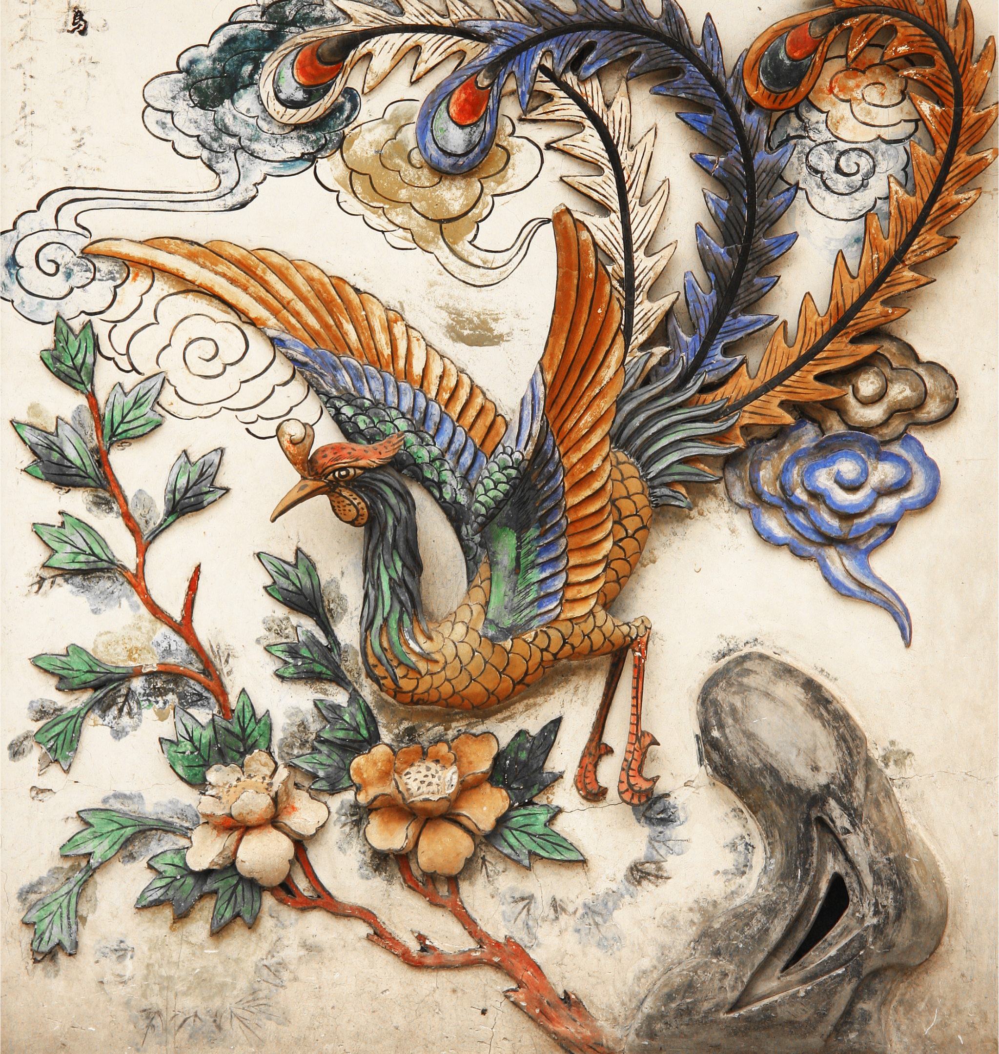
Vanguard Impact approached the design process with a clear symbol in mind: the Phoenix. They needed a visual identity that embodied their core values of innovation, empowerment, and renewal. The goal was to visualize the strength of women leading, building, and growing together.
Cultural Roots: “Dan Feng Chao Yang”
Drawing from the designer’s heritage, the concept is deeply influenced by the ancient Chinese idiom Dan Feng Chao Yang (丹凤朝阳), or “The Red Phoenix Facing the Sun.” In classical literature and art, this is an auspicious sign symbolizing a talented individual seizing the perfect moment for success. It mirrors Vanguard Impact’s vision of empowering women to rise and achieve their highest ambitions.
The Design & Symbolism
The final logo integrates these narratives into a modern, geometric form:
- The Color Palette: The colors were thoughtfully selected to balance logic with emotion. Blue anchors the brand in rationality, wisdom, and trust. Pink signifies inclusivity, empathy, and the strength of femininity. Yellow radiates creativity, hope, and optimism for the future.
- The Hidden Initials: The silhouette of the bird naturally forms the letter “V,” while the sun and the phoenix’s head align to create the letter “I”, subtly embedding the brand name (Vanguard Impact) into the icon.
- The Sun: The phoenix flies toward the sun, representing clarity, high aspirations, and a bright future.
- The Wings: The multicolored wings signify unity in diversity, showing that different strengths come together to create flight.
Design Process Snapshot
The logo you see today emerged from a deeply collaborative and iterative process. Lu explored numerous directions that played with motion, rising forms, geometric abstraction, and layered symbolism. Then the final phoenix took shape: a design that is as timeless as it is contemporary, balancing strength with elegance and meaning with simplicity.
Why the Phoenix?

The phoenix symbolizes renewal, resilience, and forward motion, qualities deeply reflected in the journeys of the women we serve. It represents rising from complexity, reinventing with strength, and leading with purpose. More than a symbol, it captures the heart of Vanguard Impact: women building their futures with clarity, courage, and community.
The Emotion Behind Our Complete Color Palette
Beyond symbolism, each color carries emotional intention:
- Blue: stability, clarity, intelligence, trust
- Pink: empathy, inclusivity, modern femininity, energy
- Yellow: optimism, creativity, momentum, possibility
- Indigo/Deep Blue: grounding, depth, professionalism
Together, they create a brand that is bold but thoughtful, powerful but warm, and unmistakably modern.
How the Logo Reflects Our Mission
The Vanguard Impact logo is not just an emblem; it’s a visual expression of our purpose.
It reflects the experience we aim to create at the Summit:
- clarity that cuts through noise
- sustainable ambition grounded in wellbeing
- growth without burnout
- momentum that feels supportive rather than overwhelming
- a community rising together
Every design choice is a reminder of what we stand for and what we are building.
What the Logo Represents to Our Community

For many women in our community, the phoenix feels like a mirror.
Its ascent represents:
- returning to yourself after burnout
- stepping into leadership with renewed clarity
- rebuilding confidence
- navigating change with resilience
- rising not alone, but alongside others
The wings reflect collective strength: a reminder that we rise higher when we rise together.
Logo System and Usage
To ensure consistency and accessibility across platforms, we use three primary logo formats:
- Primary Mark: Phoenix icon + wordmark
- Compact Icon: Phoenix only
- Co-Branded Mark: Phoenix paired with the Capital Elle Business Impact Award symbol
Each variation adapts to different environments while preserving the integrity of our visual identity.
Accessibility Considerations
Our visual identity was designed with accessibility in mind.
We prioritized:
- WCAG AA–compliant contrast ratios
- simplified, scalable shapes
- legibility across digital and print mediums
Every detail supports clarity, usability, and inclusivity for our full community.
Co-Branded Logos for Partners and Sponsors
We offer approved co-branded logo variations for sponsors, partners, and collaborators to ensure cohesive, high-quality representation across all marketing and communications.
Step into your power. Shape your future.
Join us for the Vanguard Impact Summit 2026 and be part of the movement.

